BRAND Relaunch
Brand relaunch SCHWARTE GROUP
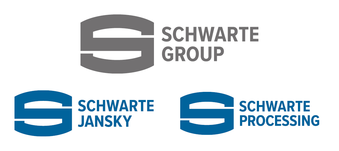
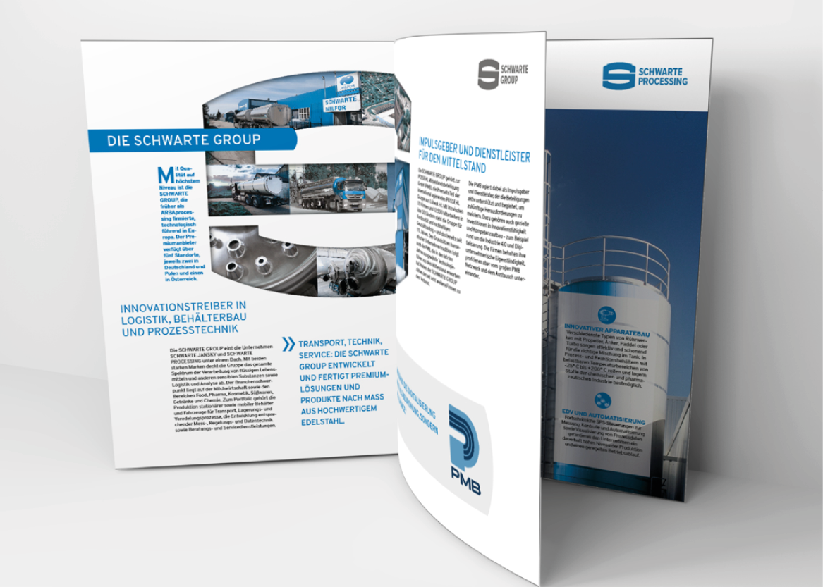
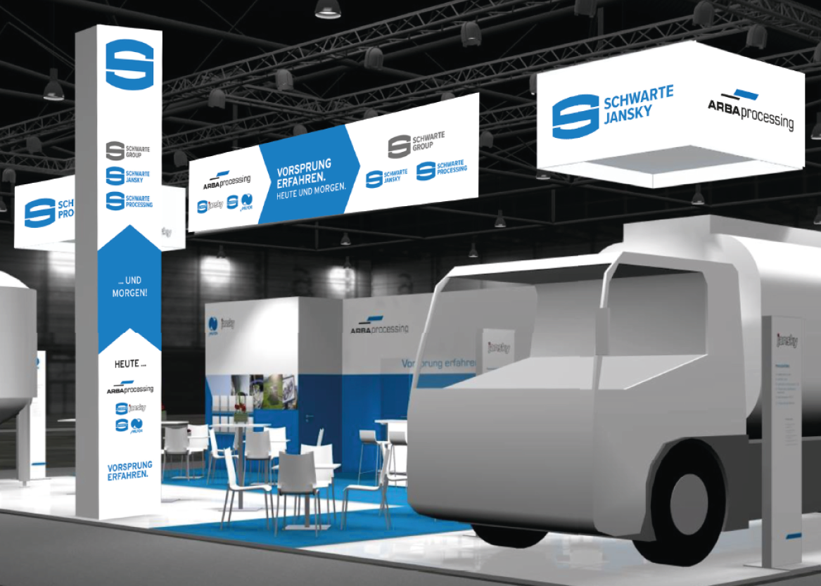
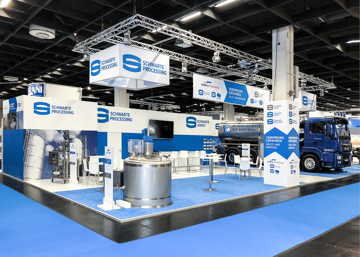
Due to company mergers and a new umbrella brand introduced in 2015, which was not sufficiently recognized by the market, ARBAprocessing and its sub-brands Schwarte Jansky and Schwarte-Milfor did not have a consistent and strong brand identity. The introduction of the new umbrella brand SCHWARTE GROUP with the business units SCHWARTE JANSKY and SCHWARTE PROCESSING therefore required a complete overhaul of the company's overall image: corporate design including logo, brochures and sell sheets, the business equipment and the websites had to be redefined and implemented. In addition, the new image had to be communicated clearly and comprehensibly to the outside world and the product innovation SCHWARTE JANSKY AKKU Vplus had to be presented at ANUGA FoodTec 2018 with a coherent trade fair concept. Our lead time for the complete implementation - 2 months! Even we call that sporty.
Together with SCHWARTE, we started the project with a brand workshop and defined a new brand architecture. The next step was to revise the sales material with new, strong sales arguments. This was followed by SEO-optimized content development, in which we ensured multiple use in different media. We were also responsible for the design and coordination of the trade fair stand with accompanying trade fair communication. We were able to successfully launch SCHWARTE's new orientation and positioning as well as its new products.
Effects achieved:
- Significantly improved sales argumentation
- Strong sales presentation of the product portfolio
- Increased customer loyalty by highlighting the SCHWARTE brand, which is highly valued in the market
- Optimized usability
- Top Google rankings for the most important search terms
CLIENT
SCHWARTE GROUP
INDUSTRY
Mechanical engineering, transportation technology
TOOLS USED
Figma, Wordpress, InDesign, Photoshop
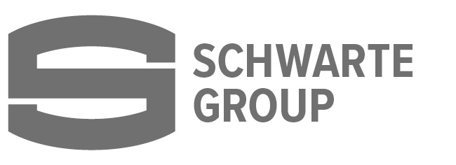
Logo development
The aim of the logo development was to create a uniform and strong brand image. The redesign of the logos is based on already strong and familiar brand elements, such as the prominent and modern "SCHWARTE S." As part of the brand relaunch, the "S" was made even more striking by removing the Schwarte lettering in the "S", allowing it to appear as a single figurative mark. At the same time, the "Schwarte" lettering was repositioned and refreshed with a modern, sans-serif font that elevates it to the same level as the epithet. This approach combines tradition with modernity and innovation and takes into account the growing number of application areas and the need for special formats. Retaining the graphic "S" from the old logo also ensures immediate recognition value, which carries the brand's identity into the future.
Design elements in the application

Do you need a successful brand relaunch? Let's talk!
DISCOVER MORE